Two Pictures Side by Side in Video: Placement and Sizing
Learn how to place two pictures side by side in a video, size and align them evenly, and avoid stretching, cropping and misleading comparisons.
You've got a talking-to-camera clip, a pair of product photos, and a deadline. You put two pictures side by side, but one face looks larger, the product label disappears, and the comparison feels uneven even though the panels are equal.
The fix starts before you drag either picture into place. Choose the canvas, define the panels, and decide what must stay comparable. A polished split screen isn't automatically a fair comparison, especially when cropping changes what viewers can see.
Canvas Sizes and Panel Sizes for Side-by-Side Layouts
A side-by-side layout contains separate panels inside a shared canvas. The canvas is your exported video frame. The panels are the windows through which viewers see the pictures, and their shape determines how much you'll need to crop.
Start with the viewing destination rather than the source photographs. A horizontal composition suits a desktop comparison, while a vertical video usually benefits from a stacked split. Putting pictures left and right inside a tall frame can leave you with narrow strips that hide the context around each subject.
Canvas and Panel Sizes by Format
The following is a worked example using chosen export dimensions, not a platform upload specification. Panel dimensions assume no gap, no outer border, and equal divisions.
| Format | Canvas (px) | First panel (px) | Second panel (px) |
|---|---|---|---|
| Vertical 9:16, stacked (Reels, Shorts, TikTok) | 1080 × 1920 | 1080 × 960, top | 1080 × 960, bottom |
| Landscape 16:9, side by side (YouTube, desktop) | 1920 × 1080 | 960 × 1080, left | 960 × 1080, right |
| Square 1:1, side by side (feed posts) | 1080 × 1080 | 540 × 1080, left | 540 × 1080, right |
| Portrait 4:5, side by side (feed portrait) | 1080 × 1350 | 540 × 1350, left | 540 × 1350, right |
The vertical example preserves width for a speaker and supporting image. The wide-format example gives viewers a comfortable side-by-side comparison. Square and portrait examples work for feed compositions, provided the subjects survive the narrow panel crop.
For this example, adding a 20 px center gap removes 10 px from each panel's divided dimension. That means width for a left/right split and height for a stacked split. Outer margins require additional subtraction.
Before building the timeline: Export a still and open it at phone size. If you can't read the label or distinguish the detail being compared, change the layout before adding captions and motion.
How to Place Two Pictures Side by Side Step by Step
Two pictures dropped onto one timeline will drift, stretch, or sit at slightly different heights unless each one lives inside its own container. Build the pair as independent layers behind fixed panel boundaries, and the comparison stays honest. The workflow is the same in Premiere Pro, DaVinci Resolve, and CapCut; only the control names change.
Build the Layout Before Adding Motion
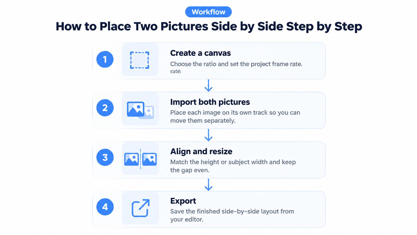
Create the canvas and set the frame rate. Pick the aspect ratio before importing your images, and match the frame rate to the surrounding video or delivery spec. Stills have no native frame rate; the timeline does.
Place each picture on its own track. Give both clips the same in-point and duration so they appear and disappear together. Separate tracks let you move, mask, or retime one panel without disturbing the other.
Size the first picture inside its panel. Lock proportions, scale until the picture covers the panel, then crop the overflow with a rectangular mask. Fill the height when the source is wide enough; otherwise fill the width and crop top and bottom. I'd rather crop hard than stretch a single pixel, because stretching changes the subject's proportions and makes the comparison dishonest.
Size the second picture the same way. Duplicate the first panel's mask or container and swap in the second image so both boundaries match exactly. Identical scale percentages rarely produce identical subject sizes when the source dimensions differ, so judge the panel by what you see, not by the number.
Set panel positions numerically. Type X and Y values into the Position controls rather than dragging until it looks close. A drag that lands a few pixels off reads as carelessness in the export, and a slightly larger panel can tilt which picture viewers read as the bigger one.
Snap both panels to one shared line. Enable snapping and align left/right pairs to a common horizontal center line, or stacked pairs to a vertical one. In Premiere Pro, check the Motion controls; in Resolve, use the Inspector transforms; in CapCut, use the built-in alignment guides.
Label each panel separately. Put a short caption inside each panel's safe area rather than one shared title on the divider. When a viewer could confuse which subject is which, an attached label settles it; a central title leaves the ambiguity in place.
Play it back before animating. Scrub the first and last frames for drift, delete any transform keyframes you did not intend, and export a short test. Motion laid over a misaligned layout just animates the mistake.
The visual workflow below summarizes the placement sequence.
Once the layout is locked, this free guide to AI video editing walks through the hooks, cuts, captions, and safe zones that turn the comparison into a postable clip.
The finished layout should have equal visual weight, deliberate boundaries, and no unintended movement. Animate only after the still frame passes.
Matching Scale, Gap and Alignment Across Both Pictures
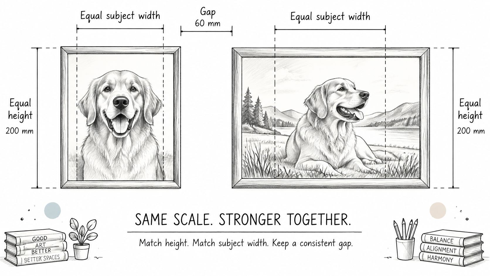
Equal panel dimensions don't guarantee an equal comparison. A tightly cropped face fills its frame and reads as larger than the same face framed loosely, and a product photographed close up outweighs a distant shot of an identical object. Viewers judge what they see inside the panels, so the sizing and cropping you choose decide whether the comparison reads as fair.
A controlled perceptual study published in PubMed Central used a fixed 3 cm gap between horizontally separated images at a 60 cm viewing distance. Those are laboratory conditions rather than export presets, and they show why display geometry belongs under your control whenever viewers judge differences between two images.
Match the Subject, Not Just the Container
Match scale using a visible reference. For portraits, use head width or eye-to-chin distance. For packaging, use the same physical feature on both products, such as the front label or bottle height, provided the products are meant to appear at equivalent size.
Avoid matching unrelated source-image percentages. A picture with generous background space needs a different transform from a tightly framed picture to produce the same subject size, and matching the file numbers instead of the subject leaves one side dominant.
Match crop using a shared landmark. Set identical panel aspect ratios, then align corresponding features. Eye lines suit portraits; shelf lines, table surfaces, or label baselines suit products. A crop that begins higher on one picture pushes its landmark out of line with the other panel, and viewers read that offset as a difference between the subjects.
Control the Gap and Fit Mode
Fix the gap numerically, then set outer margins independently. A layout with no outer border can still have a center gutter; equal outside spacing is optional. A gutter that runs wider on one side of the canvas pulls attention toward that panel, which skews an otherwise balanced comparison.
- Fill: Covers the panel and crops whatever extends beyond it. Use it for photographs when the discarded edges aren't evidence.
- Fit: Preserves the whole picture and leaves unused space where aspect ratios differ. Use a consistent background behind both panels.
- Stretch: Changes proportions to occupy the panel. Avoid it for people, products, and comparisons.
For a hypothetical 1080-pixel-wide canvas, I'd begin with a 60–100 px text inset, then adjust after checking the destination interface. That figure is a starting design allowance rather than a universal safe-zone guarantee.
Keep color handling consistent too. Don't apply automatic enhancement to one picture while leaving its counterpart untreated.
For a final balance check, cover each panel in turn, then uncover both. Your eye should travel between matching features without searching up, down, or through unrelated background.
Fixing Stretched, Cut-Off and Misaligned Pictures
A picture that looks stretched is worth fixing before anything else. It can happen when you drag a corner with proportional scaling disabled, or when an editor applies a stretch-to-frame setting.
Reset the image transform before correcting its crop. Trying to repair distorted proportions by resizing the panel leaves you with a more complicated version of the same problem.
Side-by-Side Problems, Causes and Fixes
| Symptom | Likely cause | Fix |
|---|---|---|
| One picture looks stretched | Aspect ratio unlocked while scaling | Enable constrain proportions, reset the distortion, and crop to the panel. |
| Faces sit at different heights | Crops start from different points | Align the crop offsets, then adjust until the eye lines match. |
| Gap is uneven or one panel bleeds | Positions estimated by eye | Set panel positions numerically around the canvas center using a shared gap. |
| Logo or caption cut off at the edge | Crop too tight or panel too small | Reduce the image scale until the essential content clears the safe margin. |
| One picture looks sharper | Source resolutions differ and are scaled differently | Replace the softer source with an export large enough for its panel. |
| Black bars on one side | Fit mode letterboxes the picture | Switch to fill and recenter, or use a matching background behind both panels. |
Transform, crop, and position corrections are quick timeline fixes. Missing detail is different: enlarging a small source doesn't restore lettering, texture, or edges that weren't captured.
Know When to Replace the Source
If the original design file exists, re-export it at the intended panel dimensions or larger. If the only available asset is a compressed screenshot, request the original photograph or a clean export rather than adding aggressive sharpening.
Identical crop-offset values also aren't a guaranteed fix for mismatched faces. They work as a starting point when the source framing is similar; otherwise, align the actual eye lines.
A clean export won't repair a bad placement. Inspect the panel boundaries immediately after positioning, before effects and captions make the mistake harder to isolate.
If a correction changes the visible evidence, reconsider the layout instead of forcing the crop. Keeping a complete product label in view matters more than making every photograph reach the panel edges.
When Side by Side Misleads
Say a creator places a skincare before picture beside an after picture. The after image has softer light, a warmer color balance, and a slightly different camera angle, but viewers credit the product for the entire visible change.
Equal panels can imply equal conditions without providing them. The editor's responsibility is to separate a genuine comparison from a persuasive arrangement.
Control the Variables That Change Interpretation
- Lighting and color temperature: Directional light can emphasize texture while broad, soft light reduces visible shadows. Match the setup where possible, and identify a change of lighting when it affects the result.
- Camera distance and focal length: Different capture positions can change perspective and apparent proportions. Match the camera position rather than expecting a crop to correct perspective.
- Pose and crop: A turned shoulder, raised chin, or tighter frame changes the impression. Use comparable poses and preserve enough context to understand them.
- Editing: Retouching, smoothing, local contrast, and selective exposure adjustments can change the feature being evaluated. Disclose relevant alterations rather than hiding them behind a generic edited label.
University of Missouri researchers' work on social self-comparison includes comparisons between people's real appearances and digitally altered versions of themselves. That distinction matters for beauty and fitness content: the edited image may represent an idealized self, not an independently achieved outcome.
Make the Conditions Visible
Put dates and meaningful capture conditions beneath the respective pictures. If the images came from different sessions, don't imply that every variable stayed fixed.
A slider can help viewers inspect corresponding areas when images are properly registered. An optional sequential view can also expose changes that a decorative split screen obscures, but neither format corrects unequal capture conditions.
For product demonstrations, preserve the surrounding evidence. Cropping away a different nozzle, accessory, or surface can turn a technically accurate photograph into an incomplete comparison.
Publication rule: If you can't match the crop and lighting, say so on screen.
You don't need to make every comparison look clinical. You do need to avoid presenting a styling choice as proof that a product caused a change.
Choose Your Layout Before You Export
Choose side by side for simultaneous inspection, a stacked split for a speaker with supporting proof, a carousel for pictures that need full width, and sequential presentation for a reveal. The most attractive arrangement isn't necessarily the easiest one to understand.
Sketch the options before spending time on animation.
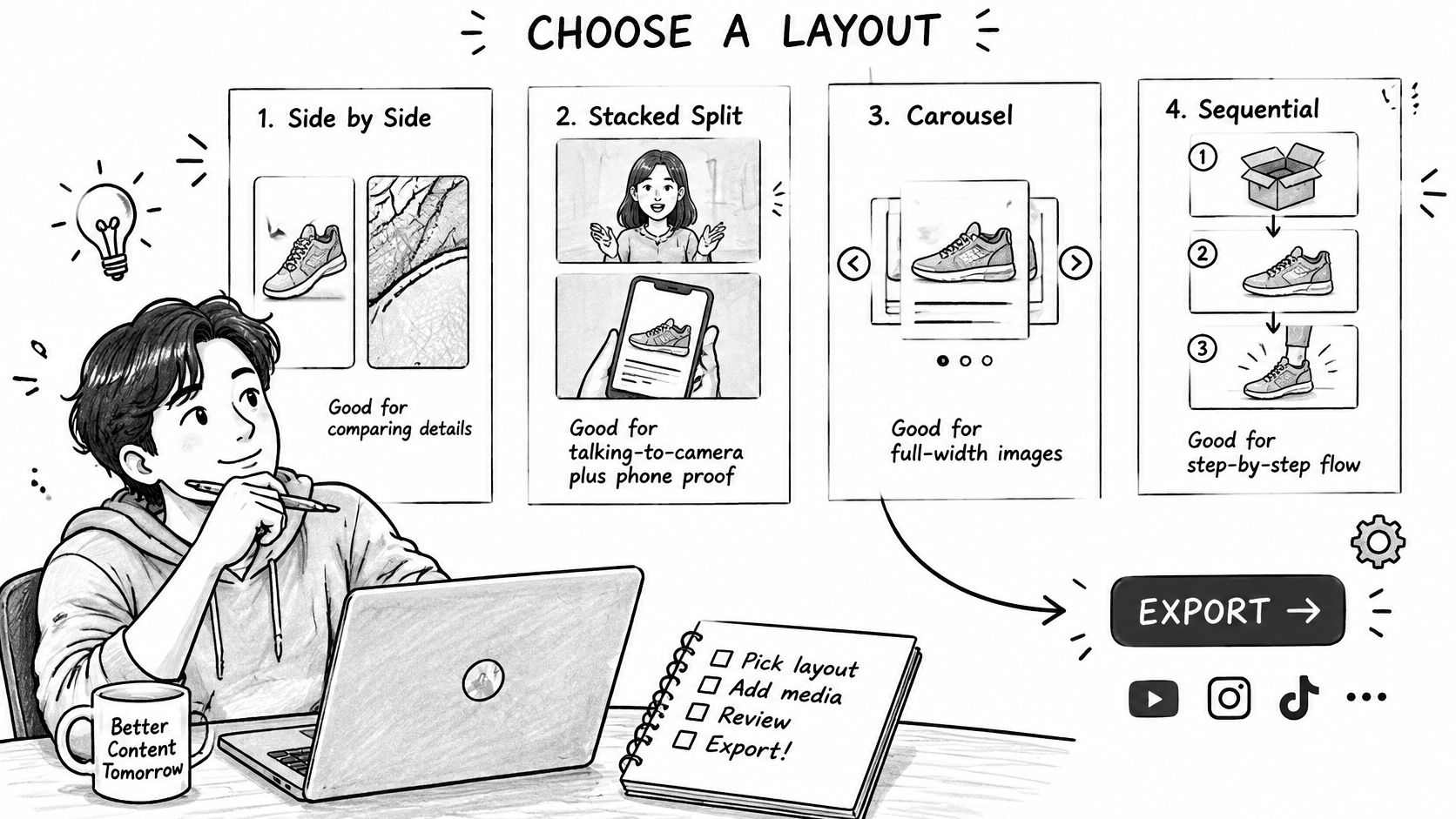
Choosing a Layout by Goal
| Goal | Best layout | Why it works |
|---|---|---|
| Compare fine detail at once | Side by side | Both pictures stay visible, reducing reliance on visual memory. |
| Keep details readable on a phone | Carousel or stacked split | Each picture retains most of the screen width. |
| Show a talking speaker with product proof | Stacked split, speaker top and product bottom | Viewers can follow the speaker while inspecting the product. |
| Reveal a change over time | Sequential flicker | The visible change becomes the focus rather than the panel arrangement. |
In a vertical feed, a left/right split gives each picture only part of the available width. If packaging text becomes unreadable, use a full-width image or a deliberate detail shot instead of shrinking the caption to compensate.
For accessibility, write descriptive alt text for each picture wherever the publishing format supports it. In video, provide high-contrast labels and explain the important visual difference through narration or captions, rather than relying on color alone.
At Mimic, our built-in Split screen style supports paired video presentation. You can add product shots or a screen recording for placement in the video, request adjustments in plain language, and keep text inside the video's safe zones.
Use the video below as a companion when considering the presentation.
Test the Reveal, Not Just the Export
A flicker reveal isn't automatically a better inspection tool. In a study of 40 JPEG2000-compressed body CT image pairs, alternation without a blank interval produced lower fidelity grades than the other display methods, while blank-interval alternation and side-by-side viewing didn't differ significantly.
That clinical result doesn't establish an ideal transition for advertising. If you choose a reveal, try a brief blank interval and judge whether viewers can understand it comfortably; avoid rapid flashing as an attention tactic.
Before the final render, confirm the goal, panel boundaries, attribution, and caption readability. Open a test on the smallest screen you intend to serve, and make sure the viewer can identify the difference without pausing or guessing.
Mimic turns talking-to-camera footage into cut, captioned videos and lets you include product photographs or screen recordings. Visit Mimic to build a split-screen edit with your own supporting media, then check that the framing shows the comparison fairly before you publish.